Sports · Cricket highlights and analysis channel
Sports Thumbnail: Using a Number as the Promise
Generic player photography was replaced with a ranked, numbered composition that tells the viewer exactly what structure the video follows.
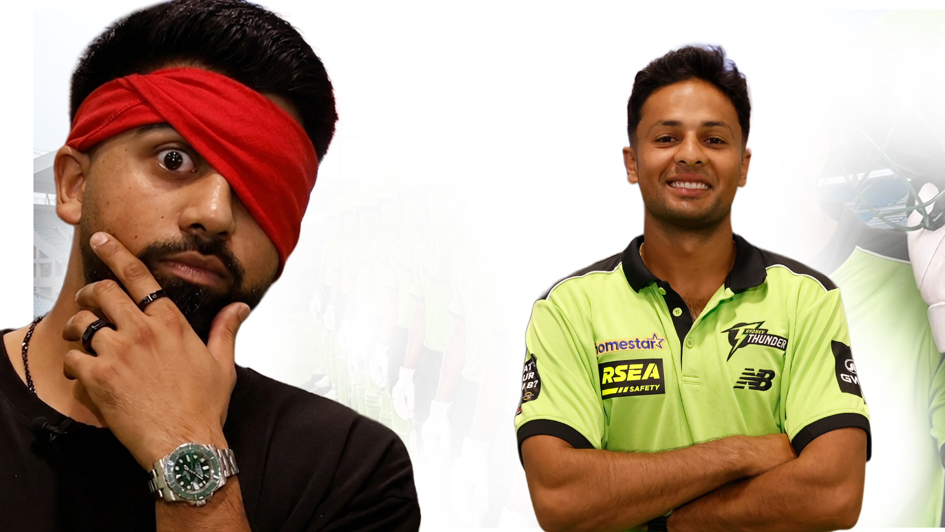
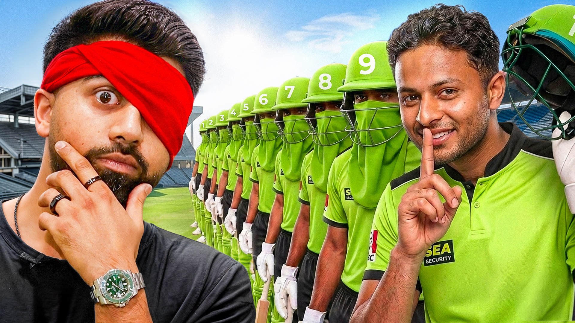
Client Brief & Objective
The channel produced ranking and analysis videos about cricket players, but its thumbnails showed players in plain jerseys against a flat background with no indication of what the video would actually deliver. Ranking content has a natural advantage in packaging that was being wasted: a number communicates scope, structure and completeness in a single glyph, and viewers trust it because it implies the creator has already done the sorting work. The brief was to make each upload's format obvious before the title is read. We rebuilt the composition around numbered helmets and a clear hierarchy — one dominant subject, two supporting subjects scaled down, and a numeral treated as a design element rather than an afterthought stuck in a corner. Team colours were pushed apart so the rivalry reads instantly, and the background was simplified to a single graded field so nothing competes with the faces. The result is a template that scales across every ranking video the channel publishes.
- Make the ranking format of the video obvious from the thumbnail alone.
- Differentiate players clearly even at small sizes.
- Build something repeatable across a long-running series.
- Respect team colour identity without letting it flatten the composition.
Design & Concept Strategy
- Treat the numeral as a primary design element with its own weight, depth and placement.
- Establish a size hierarchy: one dominant subject, two supporting subjects scaled down.
- Push team colours apart in hue and value so the rivalry reads immediately.
- Simplify the background to a single graded field so faces stay dominant.
Tools & Workflow Used
- Adobe Photoshop for cutouts, compositing and colour grading
- Adobe Illustrator for numeral construction and badge shapes
- Gradient maps for unified team colour treatment
- Blur-test previews to confirm hierarchy holds at feed size
Final Outcome & Results
- A numbered template now used across the channel's full ranking series.
- Immediate format recognition — viewers know what the video delivers before reading the title.
- Cleaner subject separation at small sizes thanks to the simplified background.
- Reduced design time per upload from a repeatable, documented layout.
Want the same treatment?
Send your video idea through the contact page and you'll get a first draft within 24–48 hours, plus a tracking ID you can follow on the order tracking page.