Podcast · Independent commentary podcast
Podcast Debate Thumbnail: Turning Two Talking Heads Into a Clash
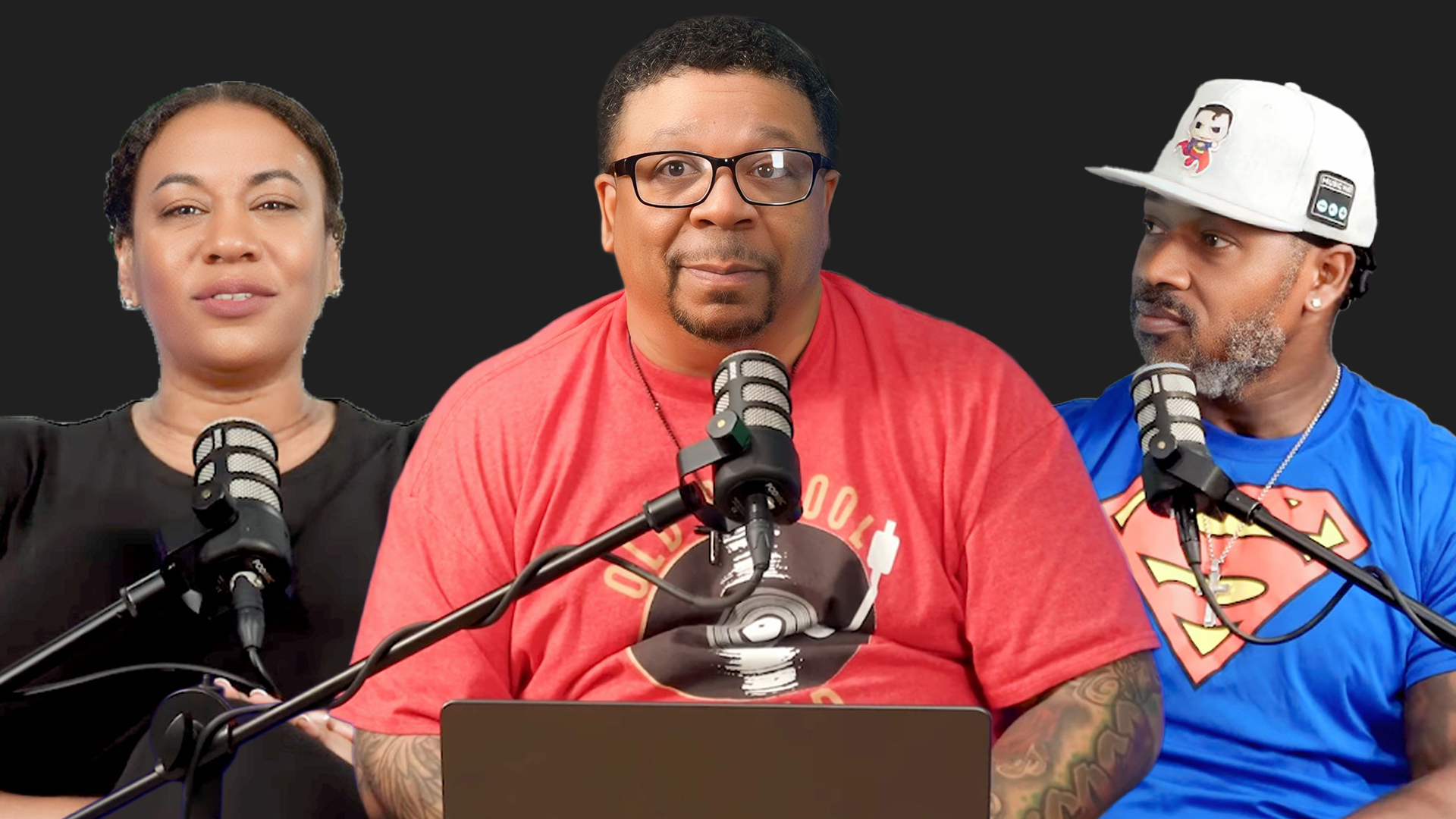
A flat two-host studio still was rebuilt into a face-off composition with clear expressions, a green energy field and a headline the eye can read at 120 pixels wide.

Client Brief & Objective
This podcast published long-form commentary episodes twice a week, and every thumbnail looked the same: two hosts behind microphones, shot in the studio under even lighting, with the episode name typed across the bottom. The images were technically clean but emotionally silent — nothing in the frame told a browsing viewer what the argument of the episode actually was, and at the size YouTube renders a thumbnail on a phone the text disappeared entirely. The channel's click-through rate had settled around three percent while watch time on the episodes themselves stayed strong, which is the classic signature of a packaging problem rather than a content problem. The brief was to keep the hosts recognisable to returning subscribers while making each episode's central conflict visible in half a second. We rebuilt the frame as a confrontation: two subjects cut out and pushed to opposing sides, expressions selected from the footage rather than posed, and a single short headline occupying the space the eye lands on first.
- Keep the hosts recognisable so returning subscribers still identify the channel instantly.
- Communicate the debate topic of each episode without a full sentence of text.
- Survive mobile rendering, where the thumbnail is roughly 120 pixels wide.
- Produce a repeatable template the channel can reuse every week.
Design & Concept Strategy
- Split the frame into two opposing halves so the viewer reads conflict before they read words.
- Select expression frames from the raw footage instead of using posed studio stills.
- Introduce a single saturated accent colour as an energy field behind the subjects to separate them from the dark background.
- Cut the headline to two or three words set in a heavy condensed face, positioned along the strongest diagonal.
Tools & Workflow Used
- Adobe Photoshop for compositing, masking and colour grading
- Manual pen-tool cutouts for hair and microphone edges
- Camera Raw for exposure and contrast matching between the two subjects
- Figma for laying out the reusable template and text safe zones
Final Outcome & Results
- A repeatable two-subject template the channel now applies to every debate episode.
- Headline text readable at mobile thumbnail size in side-by-side comparison tests.
- Consistent visual language across the series, so new uploads are recognisable in the subscription feed.
- Faster turnaround per episode because the template removes concept work from every upload.
Want the same treatment?
Send your video idea through the contact page and you'll get a first draft within 24–48 hours, plus a tracking ID you can follow on the order tracking page.