IRL / Food · Food and travel review channel
Restaurant Review Thumbnail: Lighting the Food Instead of the Room
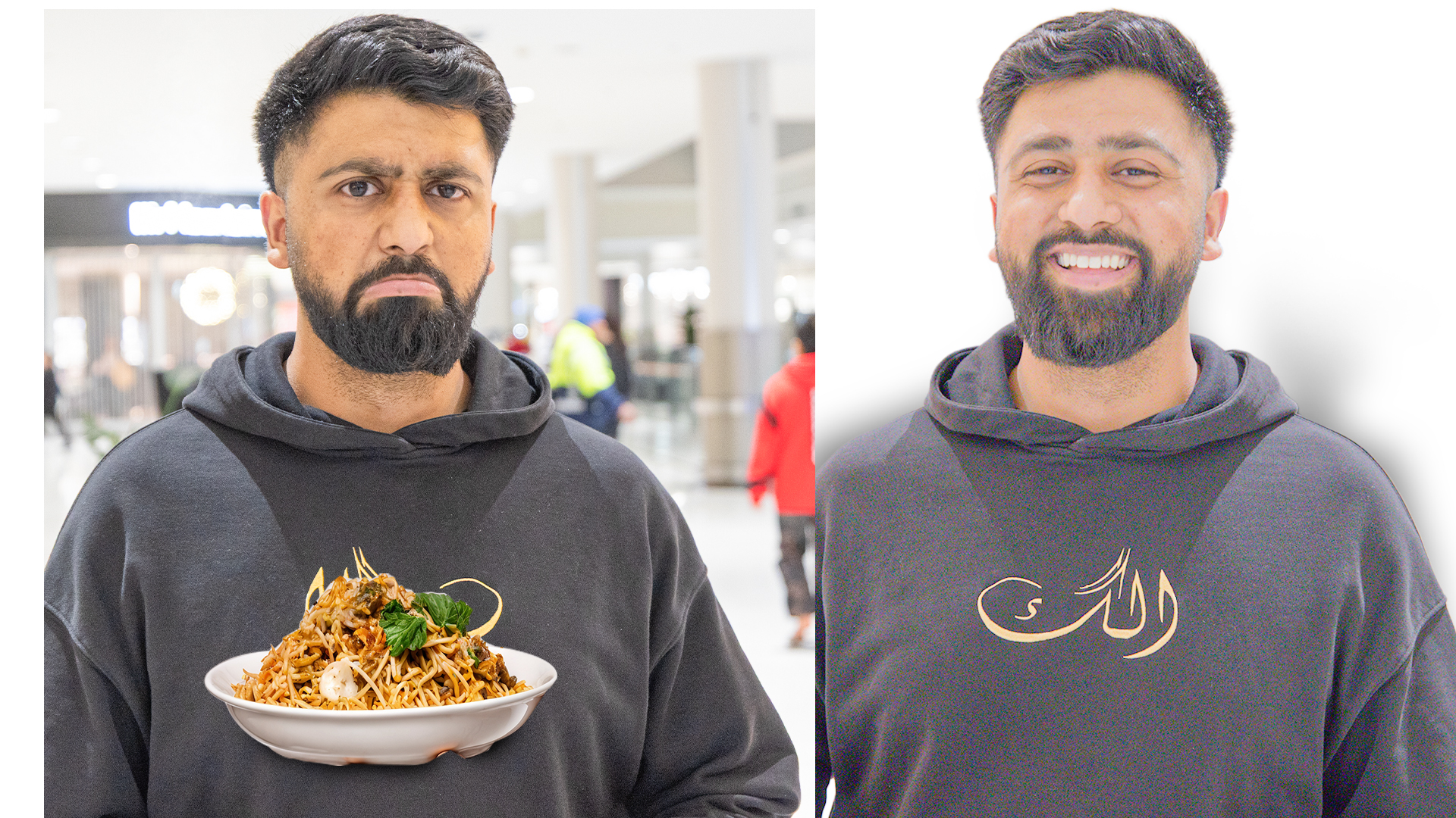
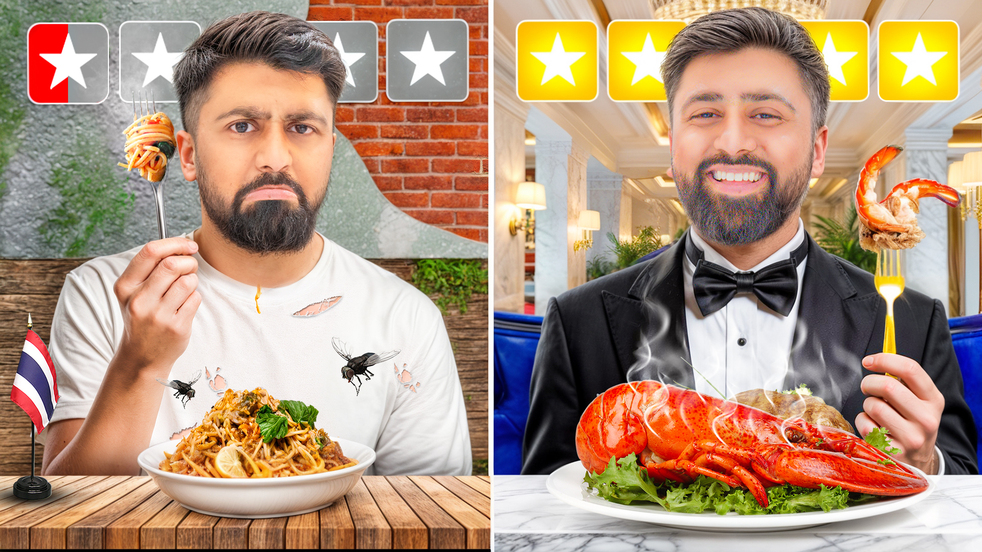
A casual phone photo of a noodle bowl became a premium plated hero shot with directional light, warm-cool separation and a clear value contrast the viewer understands immediately.
Client Brief & Objective
The channel reviewed restaurants at both ends of the price scale, and its thumbnails were mostly unedited phone photos taken at the table. The food was the subject, but the room was competing with it: overhead lighting flattened every dish, background diners pulled the eye away, and the colour of the plate blended into the colour of the table. Viewers scrolling a food feed decide almost entirely on appetite appeal, so a dish that looks ordinary in a still image loses to a dish that looks styled, even when the video itself is better. The brief was to make the food look worth watching without misrepresenting what was actually served. We kept the original photography and rebuilt the light around it: the subject was isolated, a directional key light was painted in to give the plate shape and highlight, the background was darkened and cooled so the warm food separates from it, and the price contrast that drives the video was expressed visually rather than in a sentence.
- Make the dish itself the unmistakable subject of the frame.
- Communicate the cheap-versus-expensive premise of the series at a glance.
- Work from existing on-location photography rather than a reshoot.
- Avoid overselling — the food shown must still be the food served.
Design & Concept Strategy
- Isolate the plate and rebuild a directional key light so the food gains shape, highlight and shadow.
- Cool and darken the background so warm food tones separate cleanly from the environment.
- Use a value contrast between the two halves of the frame to carry the cheap-versus-premium idea without text.
- Keep the creator's face small and secondary so appetite appeal leads the composition.
Tools & Workflow Used
- Adobe Photoshop for relighting, dodge and burn, and compositing
- Camera Raw for white balance and tone curve corrections
- Frequency separation for cleaning distracting table detail
- Adobe Lightroom presets to keep the series colour-consistent
Final Outcome & Results
- A consistent food-first look the channel reuses across every restaurant review.
- Clear premise readability: viewers understand the price contrast before reading the title.
- Better small-size performance, with the dish still legible at feed thumbnail scale.
- A reusable relighting workflow that turns ordinary on-location photos into hero shots.
Want the same treatment?
Send your video idea through the contact page and you'll get a first draft within 24–48 hours, plus a tracking ID you can follow on the order tracking page.