Educational · Design education channel
Software Review Thumbnail: Selling a Tool With Texture and Doubt
A screenshot-led software review was rebuilt around a skeptical face, tactile interface fragments and a claim the viewer wants to challenge.
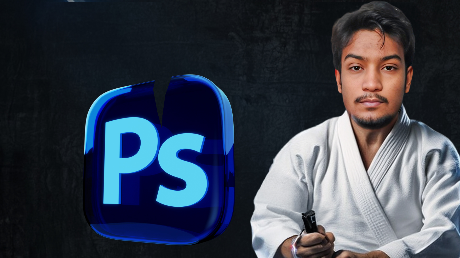
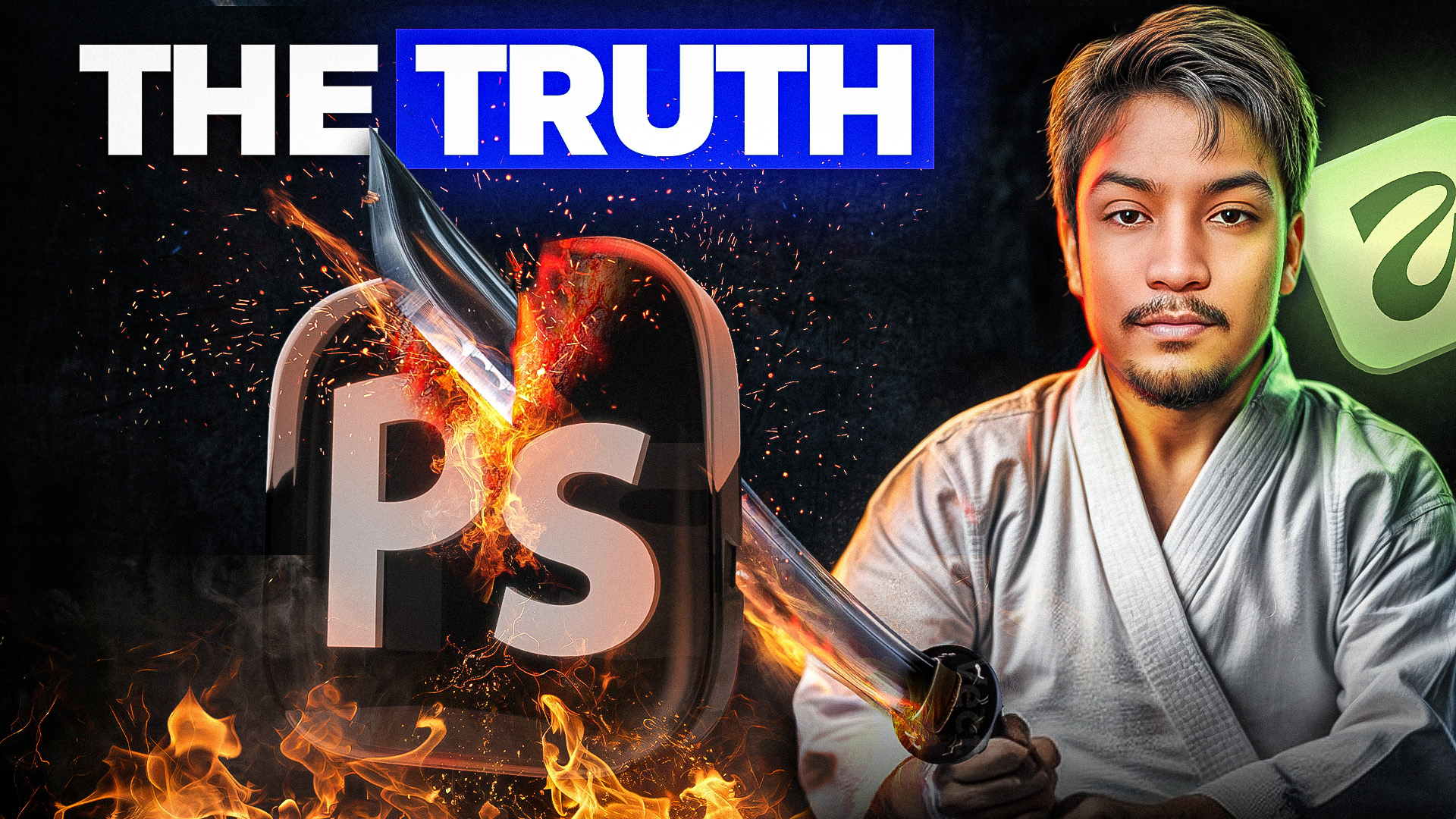
Client Brief & Objective
Software review videos have a specific packaging problem: the product is a rectangle of user interface, and interface screenshots do not read at thumbnail size. The channel's earlier thumbnails showed the app window with a title across it, which meant the whole image collapsed into grey mush in the feed. The video itself asked whether a new tool could replace Photoshop for designers — a genuinely divisive question — but none of that tension appeared in the packaging. The brief was to make a piece of software feel like a story with stakes. We built the frame around a human reaction first: a skeptical, slightly unsettled expression that mirrors what a designer feels when they hear a familiar tool might be obsolete. Interface elements were reduced to a few tactile fragments with real depth, glow and shadow rather than a flat screen capture, and the headline was written as a claim the viewer instinctively wants to argue with, which is what converts a scroll into a click.
- Package a user-interface-heavy topic in a way that reads at thumbnail size.
- Surface the debate inside the video rather than describing the software.
- Appeal to working designers without alienating beginners.
- Keep the channel's existing dark, high-contrast identity.
Design & Concept Strategy
- Lead with a human expression that mirrors the viewer's own skepticism.
- Reduce the interface to a few tactile fragments with depth, glow and shadow instead of a flat screenshot.
- Write the headline as a contestable claim so the viewer clicks to disagree.
- Hold a tight value range so the face stays the brightest element in the frame.
Tools & Workflow Used
- Adobe Photoshop for compositing, glow passes and shadow work
- Layer styles and custom brushes for interface texture
- Colour lookup tables to keep the channel's dark palette consistent
- Figma for headline typesetting and legibility checks at 120px
Final Outcome & Results
- An interface-free way to package software topics that still reads as a software video.
- A headline formula the channel reuses for opinion and comparison uploads.
- Stronger visual consistency with the rest of the channel's dark, high-contrast catalogue.
- Legibility verified at mobile scale before publishing.
Want the same treatment?
Send your video idea through the contact page and you'll get a first draft within 24–48 hours, plus a tracking ID you can follow on the order tracking page.